

Responsive Ad Units: Setup Guide for Multi-Device Monetization
Responsive ad units work when four layers agree: the page container, the GPT size map, the GAM inventory sizes, and the demand allowed to compete. Kevel frames responsive ad design around device type, screen size, platform, and orientation; in GAM, that becomes breakpoint-specific sizes, reserved space, and demand rules that do not create no-fill or Cumulative Layout Shift. Kevel Google Publisher Tag size mapping web.dev CLS
Key takeaways
- Fixed-size slots cap demand whenever the creative mix does not match the real viewport.
- In GAM, the container and breakpoint mapping matter as much as the ad unit itself.
- Reserve space before the request returns if you want to avoid CLS.
- Use fluid sizes only where the layout can absorb variable height without breaking the page.
- Mobile and desktop should not share the same size logic if they monetize differently.
Why fixed-size ad units cap fill and yield
A fixed-size slot limits fill when the eligible creative size does not match the container that renders on the user’s device. A 728x90 leaderboard is clean in a desktop top rail. In a 360-pixel-wide phone viewport, it has to be swapped, suppressed, or mapped to mobile sizes such as 320x50, 320x100, or 300x250.
You see the damage first on phones. If an article template carries a desktop-only size set into mobile, GAM and the upstream auction have fewer valid options. Header bidding adapters, AdX, and direct line items can only compete for the sizes you expose. When the page can hold 300x250 but the slot requests only 728x90, demand is excluded before price competition starts.
Where the cap actually happens
The ad unit name usually is not the real cap. The failure point is often the mix of GAM inventory sizes, GPT size mapping, CSS container width, reserved height, and creative sizes attached to line items. Google’s GPT guidance treats size mapping as the control that tells a slot which sizes are eligible at specific viewport ranges, while GAM fluid sizing is a separate creative and slot behavior. Do not blur those two controls. Google Publisher Tag size mapping Google Ad Manager fluid ad size
AdSense responsive units are container-sensitive, so the surrounding layout still matters. Google’s AdSense guidance describes responsive ad units as adapting to the page layout and the user’s device; operationally, that means the parent container, CSS width, and any reserved height shape what can render cleanly. Use Google’s documentation for the behavior, then verify it on your live templates with CLS checks. AdSense responsive ad units web.dev CLS
Where fixed sizes still belong
Do not turn every slot into a catch-all bucket of sizes. Fixed or tightly mapped sizes still matter for guaranteed sponsorships, takeover packages, HTML5 rich media, and any placement where sales sold a specific canvas. ResponsiveAds sells high-impact fluid HTML5 rich-media formats to publishers with owned-and-operated inventory, but those packages still need placement rules, creative QA, and predictable rendering surfaces. ResponsiveAds
Use flexible sizing where fill is constrained by device width. Use fixed or narrow sizing where creative control is the product. A mid-article programmatic slot can usually support a mapped set such as 300x250 on mobile and 728x90 or 300x250 on wider layouts. A homepage hero sponsorship, branded content rail unit, or custom 970x250 execution should not inherit the same open-ended rules.
How to configure fluid and responsive sizes in Google Ad Manager
Responsive setup in Google Ad Manager starts with the page template, not the ad unit taxonomy. Worked example: for a top article slot, map desktop viewports at 1024 px and wider to 970x250, 970x90, and 728x90 if the container can hold them; map tablet layouts to 728x90; map phone layouts to 320x50, 320x100, or 300x250 only if the template reserves the matching height. Then align GAM inventory sizes, GPT size mapping, line items, AdX, AdSense, and header bidding demand to that same physical space.
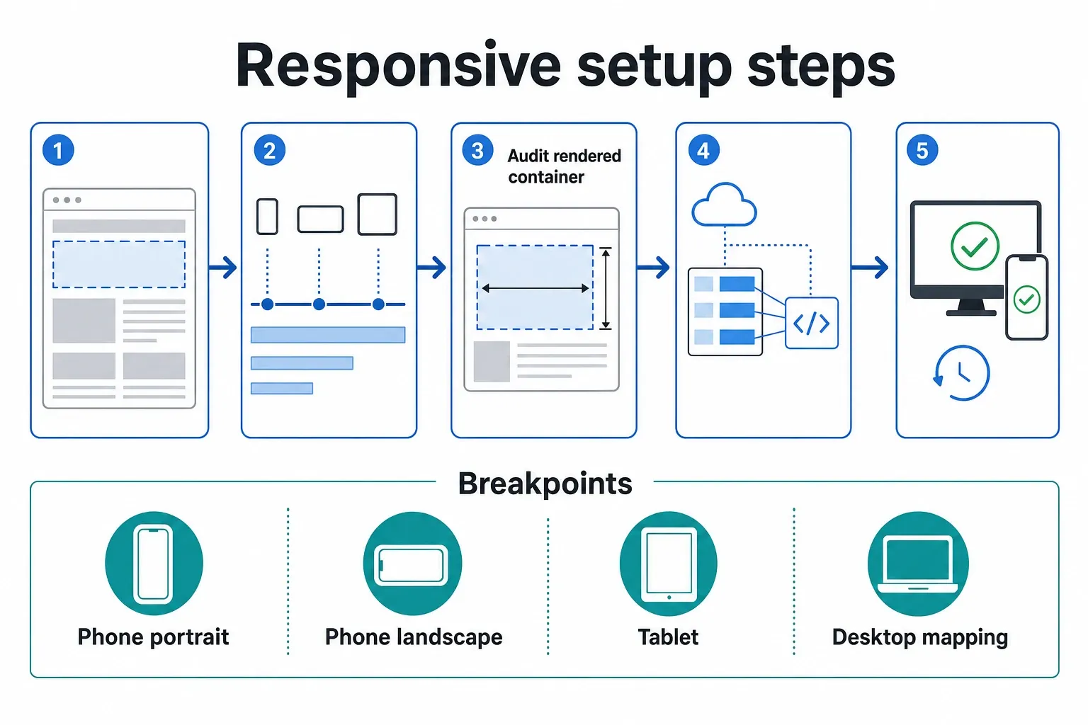
- Audit the rendered container before changing GAM. Check the actual width and reserved height for the slot on common viewport ranges, such as phone portrait, phone landscape, tablet, laptop, and wide desktop. Do this on the live template, not only in a design file, because navigation bars, side rails, sticky elements, and consent banners change the usable space.
- Create the size set around the template’s real behavior. A mobile in-article slot may accept 300x250, 320x50, and 320x100. A desktop top slot may accept 728x90, 970x90, and 970x250. Do not add sizes just because they exist in old line items; every eligible size should have a container that can render it safely.
- Use GPT size mapping to connect viewport ranges to allowed sizes. The slot should not advertise 970x250 on a 390-pixel-wide phone, and it should not be limited to 320x50 on a desktop article page where a larger unit is available. The mapping is the enforcement layer between responsive layout and monetization intent.
- Reserve space before the ad request returns. CLS problems usually come from a slot expanding after content has already painted. Use CSS to reserve the maximum expected height for that breakpoint, then collapse only where your policy and layout allow it. Core Web Vitals measurement will not care that the revenue team had a good reason for the shift.
- Use fluid sizes only where expansion is acceptable. In GAM, fluid behavior is useful for native-style units, responsive creative executions, and placements where the creative can determine its final height. It is risky in dense article bodies, feed cards, and commerce grids unless engineering has explicitly handled the height rules.
- Align line items and creatives with the same size logic. If a direct line item has only a 300x250 creative, it cannot serve into a 320x100-only mobile mapping. If AdX sees fewer eligible sizes than your wrapper exposes, bid competition gets distorted. Clean setup means the ad server and auction layer describe the same opportunity.
- Check AdSense container behavior separately from AdX and direct demand. AdSense responsive units can adapt to available ad space, but the container still controls what the system can reasonably choose. AdPushup describes responsive display ads as flexible formats that adapt to ad space, which is useful only if the page supplies a stable space to adapt into. AdPushup
How to map size sets to breakpoints without bloating the stack
Breakpoint mapping should reduce invalid demand without creating a separate trafficking universe for every device width. Group viewports by layout behavior: phone content column, tablet content column, desktop top rail, desktop right rail. Then assign only the sizes that fit the container and have real demand behind them. A 970x250 size does not belong in a 728-pixel tablet container just because it exists in GAM.
| Page type or placement | Recommended responsive setup | Fill protection | Layout stability | Engineering effort | Demand compatibility | Maintenance burden | Evidence anchor |
|---|---|---|---|---|---|---|---|
| Mobile article in-content slot | One responsive slot with phone mapping, usually limited to compact banners and medium rectangles that fit the article column | Strong, because the slot can expose more than one valid mobile size without requesting desktop inventory | Medium; reserve height for the tallest mobile size or accept controlled blank space | Low to medium; mostly GPT mapping and CSS reservation | Good for AdX, AdSense, and header bidding if all layers use the same size list | Low if shared across article templates | Kevel’s device and screen-size framing supports mapping by actual layout conditions. Kevel |
| Desktop top leaderboard | Mapped slot with broader desktop sizes, such as leaderboard and billboard options, where the header container can safely hold them | Strong for premium and auction demand because larger desktop formats stay eligible | High if the header reserves the largest approved height before render | Medium; header CSS and navigation behavior need testing | Strong for direct, AdX, and rich media when creative sizes are explicitly trafficked | Medium because sales packages may add exceptions | ResponsiveAds highlights publisher use cases for high-impact HTML5 display formats, which need predictable surfaces. ResponsiveAds |
| Homepage hero or sponsorship module | Fixed or tightly mapped setup, not a loose fluid unit | Moderate; you trade some open-market flexibility for sold-product control | High when the module has a locked canvas | Medium to high; custom creative and QA usually matter | Best for direct and sponsorship demand; less efficient for broad remnant fill | Medium because each package may have unique specs | ResponsiveAds’ focus on O&O sponsorship-style formats points to controlled placements rather than generic fluid slots. ResponsiveAds |
| Forum, community, or discussion thread | Responsive slot tied to post width, with conservative height rules and careful collapse behavior | Good if the mapping follows the thread column instead of the full viewport | Medium; user-generated content layouts make late expansion more visible | Medium; templates often have repeated slots and state changes | Good for AdSense-style adaptive demand if container dimensions are reliable | Medium to high because repeated placements multiply QA needs | Discourse Meta discussions surface the container-size issue publishers run into on responsive community layouts. |
| Commerce category or product grid | Separate targeted slots when mobile and desktop layouts differ materially; avoid one universal slot across cards and rails | Strong if mobile feed units and desktop rail units are separated | High when grid cards reserve fixed ad cells | High; commerce grids need coordination with product-card layout | Good when each slot exposes only sizes that match its cell | Medium once standardized, high during migration | Practical Ecommerce’s coverage of Google responsive ad formats is a reminder that creative flexibility does not remove page-layout constraints. Practical Ecommerce |
Use one responsive slot when the placement has the same business purpose across devices: a mid-article ad inside the content column, a repeated feed unit, or a standard top position that changes width but not sales packaging. Split the slot when the product changes. A desktop right rail that disappears on mobile should not share reporting and targeting logic with an inline phone unit. A homepage sponsor module that becomes a smaller mobile placement should usually get separate targeting, separate forecasting, or both.
Retire sizes that create exceptions but do not bring meaningful demand. Old 468x60 inventory, one-off custom banners from legacy campaigns, and duplicate mobile sizes that never win make reporting noisier and trafficking harder. Keep the size set small enough that an ad ops manager can explain why every size exists, which buyers use it, and what layout space it requires.
Mobile vs desktop demand differences that change the setup
Mobile responsive ad units need tighter control because small viewports expose height mistakes immediately. Desktop templates can often support broader size sets because there is more horizontal space, more room for premium formats, and less chance that one late-loading creative pushes the main article body down the screen. On mobile, one bad height assumption can be the whole above-the-fold experience.
Mobile: protect the viewport before chasing optional demand
On phones, the content column often becomes the ad container. Width is usually predictable; height is the risk. A 320x50 banner, 320x100 large mobile banner, and 300x250 rectangle can all be valid demand, but they are not interchangeable from a layout standpoint. If CSS reserves 100 pixels and a 250-pixel-tall unit renders, the slot either pushes content, overflows, or needs an intentional expansion rule.
Mobile also makes lazy-loading mistakes show up faster. A slot that loads after scroll can still cause CLS if the placeholder is inserted too late or its height changes after the auction. Treat the placeholder as part of the ad product. web.dev’s CLS guidance is clear on the practical fix: reserve space before content shifts, and avoid late layout changes for elements that affect the viewport. web.dev CLS
Desktop: broader sizes can work if the placement is built for them
Desktop top and rail placements can handle a wider eligible set because the layout has more surface area. A top slot that supports 728x90, 970x90, and 970x250 gives the auction more ways to clear when the container is wide enough. A right rail can often support 300x250 and 300x600 without disturbing the main article flow, provided the rail height is planned.
Rich creative needs stricter rules than standard display. HTML5 rich media, expandable units, and sponsorship canvases require coordination between GAM trafficking, creative QA, and page behavior. If a premium placement was sold as a clean 970x250 takeover, do not let a generic responsive rule turn it into a mixed auction slot without sales and yield sign-off.
Reporting: separate device effects before calling the test a win
Do not look at blended revenue after a responsive rollout and call it a win or a loss. Segment by device category, ad unit, requested size, rendered size where available, demand channel, property, and template. A mobile fill gain can hide a desktop CPM drop if the same ad unit name is reused across sites or if a premium desktop size loses eligibility.
Separate AdSense, AdX, header bidding, and direct line items in the readout. Practical Ecommerce’s discussion of Google responsive ad formats focuses on advertiser asset combinations, but publisher-side diagnosis is different: you need to know which demand source won, which size served, and whether the slot stayed stable after render. Practical Ecommerce
Testing responsive units without breaking layout or losing revenue
A safe test changes one placement, one device class, and one size rule at a time. Responsive ad units affect auction eligibility and page rendering together, so a sloppy rollout can lift CPM while hurting CLS, or clean up the layout while quietly cutting fill. Start with one high-volume template, keep a fixed control, and compare device-level outcomes before expanding.
- Pick one high-volume but non-critical placement. A mid-article slot on a single article template is safer than a homepage hero or every first ad on the site. Keep the original setup available so you can roll back without rebuilding trafficking under pressure.
- Define the exact test variant. Example: mobile article slot changes from a single 300x250 to a mapped set of 320x50, 320x100, and 300x250 with reserved height adjusted by breakpoint. Avoid combining that with lazy-load changes, floor changes, or wrapper timeout changes.
- Mirror the size list across GAM and header bidding. If Prebid or another wrapper sends 300x250 and 320x50 but GAM mapping allows only 300x250, your auction data will lie. If GAM allows 320x100 and no bidder is configured for it, the extra size may add complexity without real competition.
- Preview the creative outcomes before live traffic. Use GAM preview tools, browser device emulation, and real phones. Check the first paint state, the empty state, the filled state, and the post-refresh state if the placement refreshes. The slot should not jump after consent, after lazy load, or after a creative iframe expands.
- Measure stability and revenue together. Pass/fail should include fill rate, unfilled impressions, CPM or revenue per thousand pageviews, viewability, and CLS-related behavior. A unit that earns more by pushing content down is not a clean win, especially on templates that depend on organic search traffic.
- Inspect losing demand, not only winning demand. If direct campaigns stop serving after the mapping change, look for missing creative sizes or line-item targeting conflicts. If AdX volume drops, confirm the eligible sizes in the request and compare them with the old setup before changing floors.
- Roll out by template family, not by property name. A news article, a recipe page, a product review, and a forum thread can behave differently even under the same domain. Expand only after the tested template passes both monetization and layout checks.
- Document the final rule in ad ops language. Record the slot name, breakpoint ranges, eligible sizes, reserved CSS dimensions, demand channels, and exclusions. Six months later, someone will ask why 970x250 is allowed on one top slot and blocked on another; the answer should not live in a Slack thread.
Use this implementation checklist before shipping: confirm the placement’s business purpose; measure the real container width at each breakpoint; choose only sizes the container can render; reserve the tallest approved height or define an intentional collapse rule; align GPT mapping, GAM inventory sizes, line items, AdX, AdSense, and header bidding size arrays; split mobile and desktop when the placement behaves like a different product; report by device, template, demand source, requested size, and rendered size.
The decision rule is straightforward: expose every size the page can safely render, and no size you cannot defend in reporting.
Frequently asked questions
What are responsive ad units in Google Ad Manager?
Responsive ad units are ad slots that adapt to the available page space and breakpoint instead of forcing one fixed size everywhere. In practice, they only work if GAM sizes, GPT mapping, reserved space, and eligible demand match the real container on desktop, tablet, and mobile. The responsive behavior is a configuration outcome, not a magic property of the ad unit name.
Do responsive ad units always increase revenue?
No. Responsive ad units can improve fill and usability when the slot matches the page, but they do not fix bad demand setup. If the size list is too loose, you can weaken premium targeting, strand demand, or create layout problems. If the size list is too tight, you can block valid mobile or tablet demand that would have rendered cleanly.
Should you use fluid or responsive sizes for every placement?
No. Use responsive units where the template can safely absorb different dimensions and where demand supports that flexibility. Keep fixed or tightly mapped sizes for sponsorships, takeovers, rich media, and any placement sold around a specific canvas. Those units need predictable rendering, cleaner creative approval, and fewer surprises for sales packaging.
How do you avoid layout shift with responsive ad units?
Reserve the space in CSS before the ad request can change the layout, then test the rendered slot at each breakpoint on the live template. If a slot can collapse after no fill, make that collapse intentional and stable. The practical goal is simple: the ad may load late, but the page should not jump because the slot height changed after paint. web.dev CLS
How we researched this
Sources consulted for this article:
- Responsive AdSense Ads in Beta - WebmasterWorld
- AdSense Responsive Ads - Support - Discourse Meta
- Learning from Google's Responsive Ad Units - Practical Ecommerce
- ResponsiveAds | Simplify Resizing & High-Impact HTML5 Display Ads
- Responsive Display Ads: The Flexible Format Driving Better ROI
- Why Publishers Benefit from Responsive Ad Design - Kevel